Niural AI Brand Guidelines
Introduction
Niural is a modern HR and payroll platform leveraging AI to streamline global workforce management and compliance. These brand guidelines ensure a consistent and professional presentation of Niural’s identity across all media. The guide covers proper logo usage, official color palette, typography, and other key elements of Niural’s brand voice and visuals.
Clear Space
Maintain clear space around the Niural AI logo to ensure visibility and brand impact. The exclusion zone must equal the height of the n in the logo on all sides, preventing text, images, or other elements from crowding it. This is especially important in busy layouts like event banners, ads, or web headers.
Minimum Size
For legibility, never display the logo smaller than 280px wide (≈ 74 mm / 2.9 in), ensuring it remains sharp and recognizable in small-scale applications such as business cards, app icons, email signatures, or merchandise.
Incorrect usage of the logos
⚠️ The rules presented here are valid for both logotype and logo.
For legibility, never display the logo smaller than 280px wide (≈ 74 mm / 2.9 in), ensuring it remains sharp and recognizable in small-scale applications such as business cards, app icons, email signatures, or merchandise.
Color
Niural AI’s core colors are Niural Purple and Niural Pink, representing innovation, clarity, and energy. Use Niural Purple as the primary brand color for key elements like buttons, icons, and highlights, and Niural Pink as an accent for emphasis and visual interest.
Niural Purple

Niural Pink

Neutral Palette

Tints & Shades

Color usage guidelines
In general, Niural Purple should dominate in branded materials (e.g., used in logo and key buttons or headers), with Niural Pink used as a secondary accent to complement it. The neutral colors (gray, white) serve as the foundation for text and backgrounds, ensuring readability and a professional look. Maintain consistent color usage to strengthen brand awareness—do not arbitrarily introduce new colors that are not in the approved palette, and use the defined colors for their intended purposes (primary for main highlights, secondary for supporting elements). By consistently marketing with the same core colors, Niural creates a cohesive identity across its products and touch points.
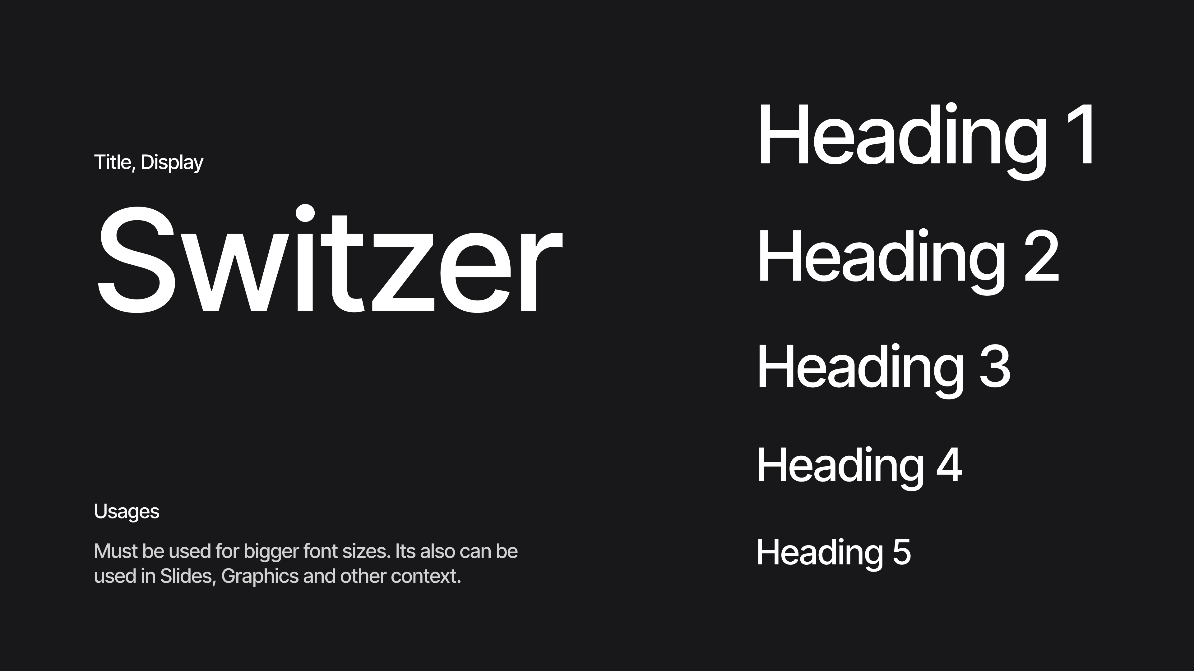
Typography
Niural's typography is carefully selected to project a clean, modern, and approachable tone. A sans-serif typeface serves as the primary brand font, reflecting Niural's tech-centric and user-friendly personality. (For example, Niural's materials use a font similar to Helvetica/Arial or modern web sans-serifs like Inter or Montserrat—a simple, legible style.) This primary typeface appears across all marketing and user interfaces, ensuring consistency and recognition.
Additional Brand Elements
Tone of Voice
Niural’s tone of voice is confident, innovative, and inclusive. All messaging should be clear and down-to-earth – avoiding jargon when possible – while still conveying expertise in HR, payroll, and technology. The company prides itself on an inclusive and approachable culture, and this is reflected in the brand’s communications. Copy is written in an upbeat but professional style: Niural speaks as a helpful expert or “co-pilot” for global HR management. For example, Niural’s tagline is “Modern HR and Payroll infrastructure for a global world.”– a straightforward statement that emphasizes modernity and global reach. The voice is helpful and solution-oriented (focusing on how Niural solves problems), with an optimistic and forward-looking tone (highlighting innovation with AI). Niural avoids overly formal or academic language; instead, it favors a friendly, conversational tone as if speaking with the user. However, it also steers clear of slang or gimmicky humor, maintaining credibility appropriate to financial and HR matters. In practice, this means marketing copy and documentation use simple, active sentences and positive language. For instance, rather than saying “Niural’s platform might help you manage compliance,” the copy would affirm, “Niural’s platform streamlines compliance so you can focus on growing your business.” The tone is empowering and assuring. Always consider diverse audiences in messaging – Niural communicates in a way that is respectful and understandable to people across different backgrounds and regions (since it’s a global platform). By balancing expertise with approachability, Niural’s voice builds trust while remaining relatable.
Imagery and Illustration Style
All imagery — whether illustrative graphics or photos — should be consistent in style and quality. This means using a cohesive color treatment (e.g. a common brightness/contrast level and the brand color accents) and a similar point of view. Graphics often use a mix of Niural Green and Blue for highlights, and any characters or icons follow a unified design language (for instance, if using outline icons, the stroke style and corner radius should be uniform across all icons). By maintaining consistency in illustration style and photo mood, Niural ensures that every visual element feels like part of the same story, reinforcing brand recognition .
When photography is used (such as in case studies, team photos, or social media), the guidelines emphasize authenticity and diversity. Photos should feel natural and inclusive, featuring real people in realistic work settings rather than overly posed stock models. *Capture candid, authentic moments* that reflect professional environments and teamwork . For example, a photo might show a business team discussing a project or an employee happily working remotely – always appearing genuine. Avoid images that look overly staged or where subjects stare unnaturally into the camera . Niural’s brand photos, if any, should convey the human benefits of its product (e.g. relieved HR managers, happy employees being onboarded globally) and reinforce a sense of trust and forward-thinking. Ensure a variety of people are represented (different genders, backgrounds, etc.), aligning with Niural’s inclusive values. The color tone of photos is usually bright and clear (well-lit with natural lighting) to match Niural’s optimistic tone – no heavy filters or dramatic shadows.
All imagery — whether illustrative graphics or photos — should be consistent in style and quality. This means using a cohesive color treatment (e.g. a common brightness/contrast level and the brand color accents) and a similar point of view. Graphics often use a mix of Niural Green and Blue for highlights, and any characters or icons follow a unified design language (for instance, if using outline icons, the stroke style and corner radius should be uniform across all icons). By maintaining consistency in illustration style and photo mood, Niural ensures that every visual element feels like part of the same story, reinforcing brand recognition .
Iconography
Niural’s icons (as seen in its UI or marketing materials) are simple and line-based or solid minimal shapes. They are immediately understandable – e.g. a globe icon for “global payroll,” a shield for “compliance,” a checkmark for “automation success,” etc. Icons use the brand colors (often the green for filled icons or blue for accents) and are used sparingly to support text. When designing or using icons, maintain a consistent stroke weight and style. Do not mix vastly different icon styles in one context. All icons should include sufficient padding and clear space so they are legible.
Typography in imagery
When overlaying text on images or colored backgrounds (such as banner images or infographics), use Niural’s fonts and colors in a way that is highly legible. Typically, white or charcoal text is placed over Niural Blue or Green backgrounds with sufficient contrast. If needed, a translucent dark overlay can be applied to an image to ensure white text stands out. The tone of any copy in images should remain on-brand (e.g. a short tagline or call-to-action in a social media graphic should use the same friendly, confident voice).
Brand Applications
In practice, these guidelines apply to everything from Niural’s website and app UI, to printed brochures, pitch decks, business cards, and social media posts. For example: - Web pages may use the Niural Green for action buttons (“Get Started”) and Niural Blue for hyperlink hover states or graphic accents, with text in neutral dark gray on a white background for readability. - The company’s PowerPoint or document templates will feature the logo on a white or light cover, use the brand colors for section headers or charts, and the approved font throughout. - Social media graphics might include the Niural logo on a clean backdrop, a bold headline in the Niural font, and an illustration in brand colors, all adhering to the outlined standards.
Downloads and Assets
As of this guide, Niural’s official logo files (in SVG/PNG formats), color swatches, and font files or specifications can be obtained through Niural’s brand/marketing team or partner portal. (There is no public “brand asset center” on the website yet, so partners and media should contact Niural for the approved artwork and guidelines.) Always use the provided high-resolution or vector logo files – do not copy the logo from the website via screenshot, as that may introduce color or quality issues. Similarly, use the exact color values listed above for any printed materials to ensure color accuracy. Following the guidelines in this document will ensure all representations of Niural are consistent with the company’s identity and values.
Summary
Niural’s brand identity is a reflection of its core mission – bringing intelligent, seamless solutions to HR and payroll. By adhering to these guidelines for logo, colors, typography, and imagery, all communications will speak in a unified visual voice. This consistency builds trust and familiarity with Niural’s audience. Every employee, designer, or partner creating Niural-branded content should reference this guide to uphold the brand’s integrity. Niural’s forward-looking, inclusive spirit should shine through in every logo placement, every line of text, and every graphic element, presenting a cohesive and memorable brand to the world.